
PACDEFF 2025.
Typography in aeronautical charts— What’s the problem?
Conference presentation
Abstract
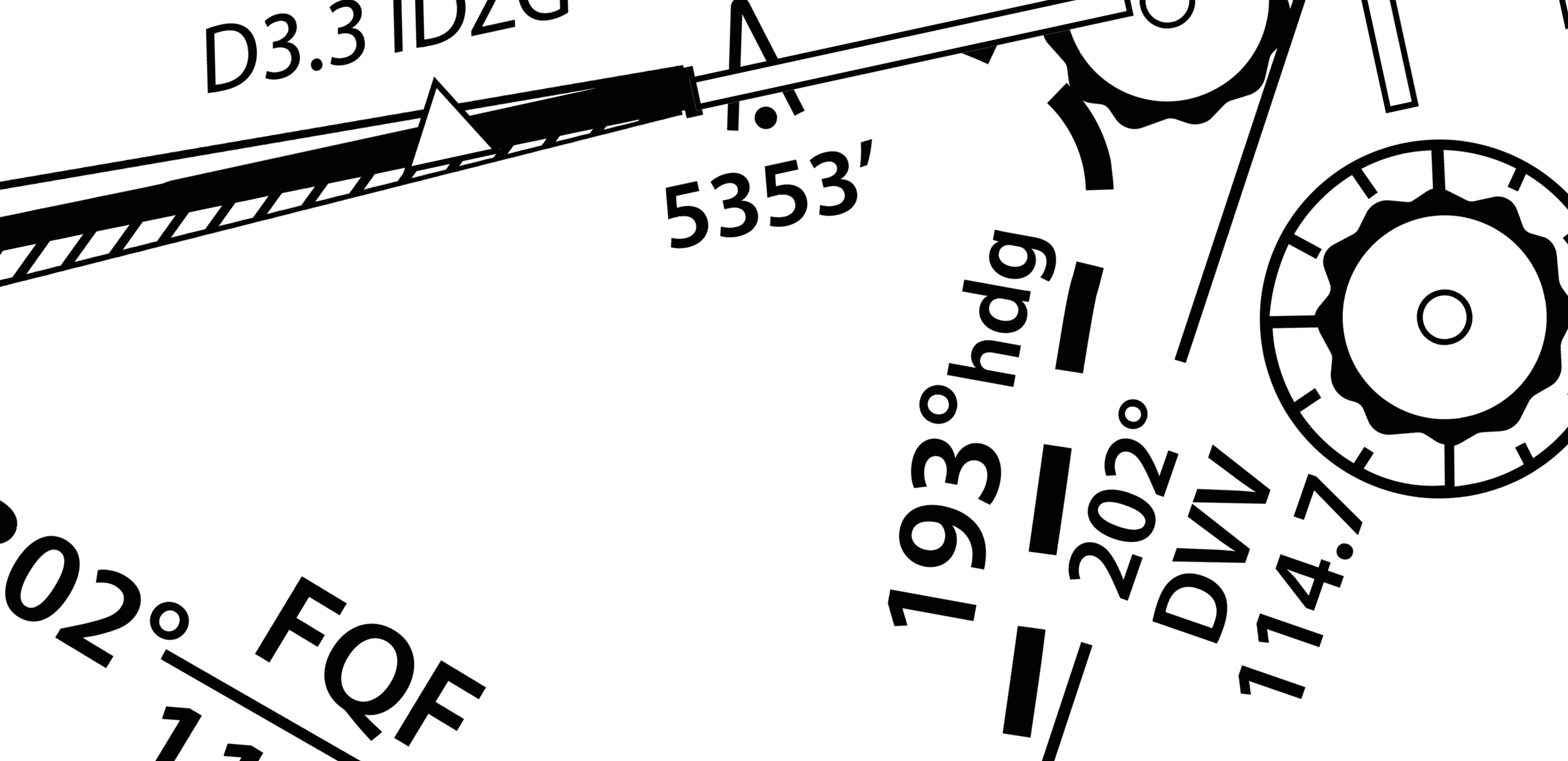
Aeronautical charts have been an essential part of aviation for over 100 years, evolving from handwritten notes in loose-leaf booklets to printed materials and, more recently, electronic formats. However, despite their significant role in navigation, they have been repeatedly criticised for poor design and typographic issues. In reports submitted to NASA's Aviation Safety Reporting System (ASRS), several pilots expressed concerns about the persistent design deficiencies, pointing out that typographic and layout ambiguities frequently cause crucial information to be misinterpreted or overlooked. For instance, some contemporary charts display a combination of multiple typefaces (fonts) that often impair legibility rather than promoting clarity. In some cases, up to three distinct typefaces are used without apparent rationale.
The goal of this presentation, which draws partially from research conducted during my PhD, is to critically explore legibility challenges faced by pilots when interpreting aeronautical charts. This will involve identifying specific shortcomings in current chart designs. Furthermore, strategic typographic solutions promoting clarity and effectiveness will be discussed.
By addressing typographic issues in aeronautical charts, their effectiveness can be significantly improved, supporting safe navigation. This presentation will offer actionable insights to enhance chart design, benefiting both pilots and flight safety as a whole.