PhD Study.
V1—A type design approach to facilitate pilot information processing
Introduction
The PhD study examines how legibility is influenced by the shift from paper-based to digital documentation in aeroplane flight decks. Manuals, maps, charts, and checklists are now stored in Electronic Flight Bags (EFBs), thus accessed through a single digital device, which has transformed how pilots interact with data. Although EFBs are now widely used, the typography still relies on outdated print-based conventions, which may not be suitable for digital screens in modern flight decks.
The research explores how typography in EFBs can be improved, specifically through the use of Variable Fonts (VF), which enable customisable text settings to better meet pilots' needs. The study investigates how adjusting these settings can improve legibility and the user experience, especially in the context of pilot fatigue and overall flight safety. It challenges traditional typographic conventions in aviation, promoting more personalised and adaptable design solutions that suit individual preferences.
The outcome of the research is the new VF named V1, which includes a weight and serif axis. This allows the typeface to transform from a hairline sans-serif into a black serif font. Additionally, the pilots can adjust the type size, line height (leading), character spacing (tracking) and select alternate characters in the sans-serif font.
Ultimately, the research argues that typography plays a crucial but often overlooked role in legibility in a flight safety context. Customisable typography, as demonstrated by the V1 typeface, has the potential to improve both readability and user engagement by allowing real-time adjustments based on pilots’ preferences, physical conditions and environmental factors. This represents a significant shift from static text to an interactive tool, highlighting the importance of considering the user's experience when designing flight deck documentation.
V1 Type Specimen
The following sections showcases V1, its character traits and abilities.
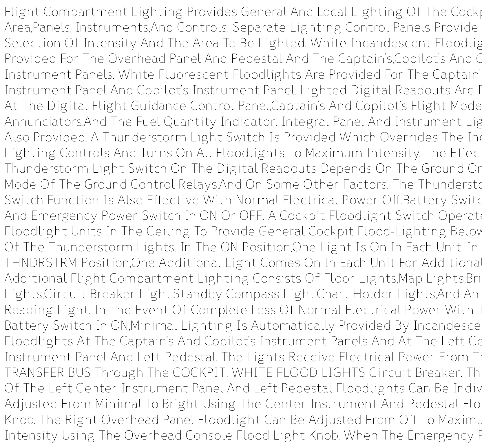
Hairline sans-serif

Weight axis
V1 features two variable axes, allowing the user to take responsibility for their own legibility. The weight axis enables shifting from a hairline to a black font. However, due to V1’s variability, any intermediate step between the masters can be selected, allowing the user to fine-tune the settings to their individual requirements.
Hairline serif

Spacing
Often overlooked, character spacing is as important as the character proportions themselves. This is also connected to an even typographic colour, which refers to the relative tonal contrast between a text block and the substrate, which is usually white (Google Fonts, n.d.).


Black sans-serif

Black serif

Serif axis
The serif axis allows transforming V1 from a sans-serif to a serif style.
Numbers

Legibility traits
V1 was designed based on contemporary legibility research. Consequently, it exhibits open character shapes, characters that are easily distinguishable from one another, wider narrow characters and a large x-height.

Development
V1 was created through several iterations based on user and peer feedback. As demonstrated below, not everything worked straight away. This glitch occurred because the first anchor points were not in the same position in every master.


Presentation at AtypI 2024 in Brisbane
In April 2024, I had the privilege of presenting some of the results of my PhD research at the Association Typographique Internationale’s (AtypI) annual conference in Brisbane. It was an excellent opportunity to receive feedback from typographers from around the globe.
